Originally published on MamaYe.
In a world oversaturated with data it can be hard to know which evidence to pay attention to or where to find the data you need.
Static pie charts and line graphs are no longer sufficient in our digital age – we need tools which marry data visualisation with the latest consolidated, definitive and trusted evidence.
We need tools which give us the freedom to choose how to compare, contrast, and chart so that you can actively engage in the use of data.
These tools will enable us to convey complex arguments or identify complex issues to lay audiences. For expert audiences these tools will guide decision-making so that we implement the best possible intervention.
These tools will enable us to persuade with authority, to have our voice heard, even when technical knowledge or literacy levels are low. This will guide our advocacy, so that we ask for the best possible intervention.
In the maternal and newborn health field, we are lucky to have a range of data visualisation sites on offer.
For example, African Health Stats allows you to chart, map, and compare key health indicators across all 54 African Union member states. The brainchild of the African Union, it’s packed with the latest data from reliable international sources for 33 indicators in the four themes of RMNCH, HIV/AIDS, TB and malaria, and health financing.
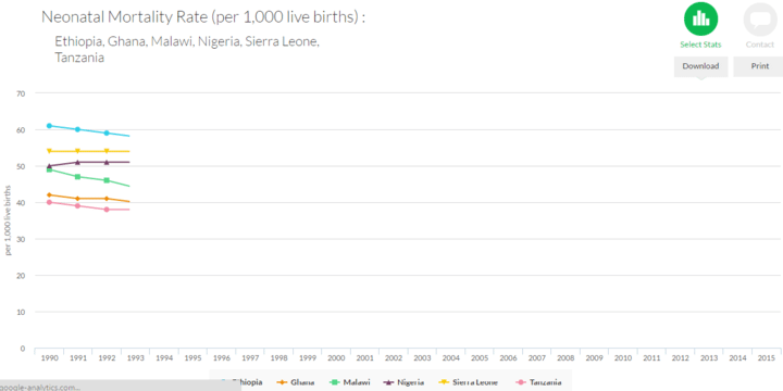
Neonatal mortality rates in Ethiopia, Ghana, Malawi, Nigeria, Sierra Leone and Tanzania from African Health Stats
The site also guides users to easily understand the data with explanations of what the data means and why the indicators matter. Combine your choice of indicator and country to create one of four types of data visualisation. You can even download the data visualisations to add to your evidence or policy statement.
Also, meet the hot-off-the-press Newborn Numbers data visualization tool on the Healthy Newborn Network.
It gives easy access to reliable maternal and newborn health data to help decision-makers allocate resources effectively and prioritise implementation efforts to improve access and quality of care for mothers and babies.
Data include the global burden of newborn and maternal deaths; when, where, and why they are dying; as well as solutions for preventing deaths and resources available for action.
You can run multiple scenarios to see the impact of individual or collective actions, to help prioritise investments, or evaluate programmes.
Percentage of neonatal deaths caused by preterm birth complications, 2013 from Newborn Numbers
A final site to have a look at is the Lives Saved Tool, which you can use to model the impact of scaling-up health interventions aimed to reduce mortality and morbidity in mothers, newborns, and children under 5 years of age.
These tools all allow you to take charge of understanding and then using the data. No longer must we merely be shown the evidence, passively accepting the comparators or the presentation. This flexibility allows us to be more sophisticated advocates, implementers, researchers.
Share your experiences of using these or other tools and inspire others to take evidence-based action.